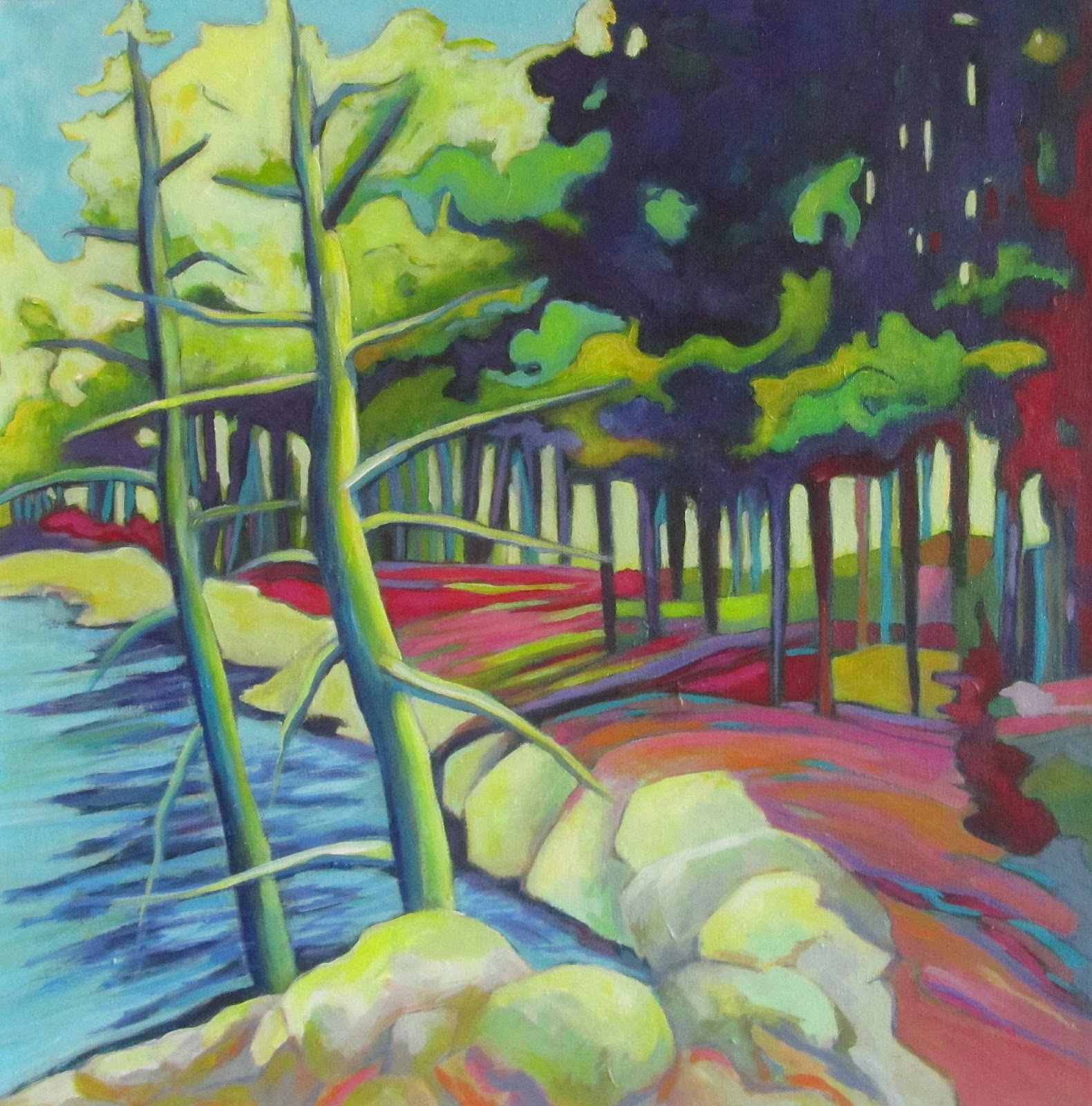
Showing posts with label abstract landscape painting; abstract landscape; expressive landscape painting. Show all posts

Wednesday, 24 July 2019

Wind in Her Sails

Wind in Her Sails
12" x 16" - acrylic on paper - $75
This stand of trees has been an inspiration for many past paintings and perhaps because I am staying on Redstone Lake in Haliburton, it's summer and I am in close proximity to the little island on which the trees sit, it spoke to me once more - or maybe I just returned to tried and true imagery - and had some painting fun once again. 

Thursday, 14 March 2019

Regeneration


.  
Regeneration
24" x 30" - acrylic on canvas - SOLD
I am so happy with how this painting turned out. I love the palette, the brushstrokes and the abstraction of form. It's based on a photo I took a few years ago of 'some trees in a clearing', that was not particularly striking or unusual but did offer compositional possibilities. The painting went through several stages with some thinking time between. Regeneration, the process of renewal, restoration and growth. For all living things, including us.  
Sounds good to me.  


Thursday, 21 December 2017

Night Falls

Night Falls
17.5" x 14" - acrylic on paper - $50
If you saw my previous post you might notice a relation between that recent painting called Day Breaks and this one. Night Falls grew out of the other but is much darker, smaller and was done using a palette knife. I wanted to try to suggest the idea of 'night falling on land', using a dark sky with some mysterious lighter areas. In the beginning I worked with a brush, and added more inktense coloured pencils, but eventually used a palette knife to stop myself from making it all too tight. I think it worked and though it is dark, I quite like the overall effect. 


Thursday, 21 September 2017

30 in 30 - Day 21 - Northern Scene

Northern Scene
11" x 11" - acrylic and pastel on canvas paper - SOLD
I tried to work the brush marks in this little painting, wanting them to just stand up and be more visible, and then added soft pastel lines on top of that for a little more expression. I really like the result, and have to say that the painting 'in life' is much richer in terms of colour and depth than what the camera (and photographer) was able to capture, unfortunately. 
It's Day 21!


Saturday, 26 August 2017

Island on Redstone

Island on Redstone
18" x 20" - acrylic on canvas - $300
I have tried to paint this particular view of a small island - it is just trees and some rocks - near my cottage on Redstone Lake in Haliburton, several times. This time, however, I am quite happy with the result. I think the very stylized forms and expressive palette 'work' - and are more interesting than the reality: green trees on a grey lake, with a grey sky and grey-green background hills.
Hope that you are having a wonderful weekend!


Sunday, 30 October 2016

Autumnal Intensity

Autumn Intensity
8" x 10"  -  acrylic on Canson canva paper  - $65.
The weather in SW Ontario where I live, at least some of the year, has turned from beautiful autumnal warmth to bitterly cold, rainy and glum. What can I say, it's feeling like November. Yuck. I painted this yesterday when I was feeling in need of some heat and colour. (Note: while the colours are accurate in this photo, it was difficult to capture the brush marks; the painting is much better in real life). 

Tuesday, 4 October 2016

Creative Fun - Day 5

Weather continued to be unsettled towards the end of my first week at Les Bassacs so we painted around the house and 'hamlet', which is a collection of very old buildings, homes, farm buildings, and pathways and narrow roads meandering out to the surrounding cherry orchards, vineyards, lavender fields and olive groves. In other words, lots of potential subject matter.


I took lots of photos and back in the studio worked on several paintings, and finished up with these:
once again examples of looking at the scene, then starting with a basic drawing and then allowing ideas to develop and playing with colour. Good creative fun.

Neighbour's House, Down the Lane, Provence
Farm Building, Provence

Tuesday, 14 June 2016

Strata

Strata
30" x 24"  - acrylic & collage papers on canvas - $ 400
I can't really say where this came 'from', other than my imagination and the work I have been doing lately which has involved high horizon lines and abstracted shapes to suggest the 'land' below. When I began this painting I knew that I wanted to work with less colour (a challenge for me) and lots of neutral greys, which is how I began.


1
2
3


detail of top of painting


As I painted I began to add some cream, grey, black and printed Japanese collage papers which provided some interesting texture. And of course some colour did get mixed into my greys. I am really happy with the finished painting and must say that the computer screen does not do it justice - it really is quite stunning when you see the varied quality of the surface and different layers or strata. The top of the painting with the blue sky and orange trees glows literally with light.  Cheers!


Sunday, 12 June 2016

Study in Pink: the Ecstasy and the Agony

Study in Pink
mixed media: watercolour, gouache, pastel - 8" x 10"
I am continuing to explore painting in a looser abstract way and wanted to post another work that I started at the same time as Terra Firma.  It was inspired by the study above which I love. I had recently purchased some large canvases (36"x48", and 48"x60") and was eager to paint big, so opted for the 36 x48 and started out this way.....
1
It felt like a good 'start' and after about 2 hours I had this (2). It was a good time to stop and just look at it over the next few days, and consider next steps.

2
I really liked the painting at this point and probably should have left it alone, or at least done less when I finally returned to it.  However I started painting, tinkering, painting and refining - and then it was finished - but over worked and boring. (I forgot to take a photo of it at this stage)  I turned the canvas to the wall and waited until I was ready to be bold again.   Finally. after a few days, I thought what the heck, and with a purple acrylic paint marker in hand I began to draw on the canvas surface defining abstract shapes in the lower foreground and at the horizon line, while paying attention to the few areas I still liked.  Then I changed the colour of the middle ground using a very light greenish grey neutral that really looked great beside the pinks and reds.  Essentially I was adding in some large colour areas.

3

4
So here is what I have now (5) - but, it's not done yet! Though there are are more areas that I like, I still think some radical thinking and painting should/will happen. The composite needs work. It's hanging over my living room sofa and every morning, with coffee in hand  I contemplate what to do next. Any thoughts? - I would love to hear them! To be continued.....
5 - current state


Saturday, 5 March 2016

Arcadian Woods

Arcadian Woods
30" x 40" - acrylic on canvas - $800

This is another landscape painting I recently finished in which interpretation is more important than representation. It is now on display at the Longboat Key Centre for the Arts (Florida) as part of their annual juried 'Community' Exhibition. 


Thursday, 3 March 2016

Interpreting the Landscape - Scorcher

Scorcher
36" x 36"  - acrylic on canvas  - SOLD

Since posting Radiant River  a couple of weeks ago I have continued to experiment with ways to abstract and interpret the landscape and use it as a vehicle for exploring the visual language of painting - colour, composition, value, form, movement and the paint itself. I decided to work with that particular landscape subject again, but in a square format and the result is Scorcher. This is how it evolved over a number of days and many long hours.

 
 I love drawing on a fresh white (that's right - no ground or underpainting here!) canvas with an inktense crayon - they are soft and smudge as you draw and when you wet the lines with water, they explode and smear and drip. I used a red crayon because I wanted a bold, hot colour scheme and so began with reds, pinks and yellows, applying them in big loose strokes.
After that came the hard part - refining the palette, working  on values and making decisions about where this painting was going and how I would get it there. Not as much fun. 
I added surface marks in the form of 'lines', using pastels, inks and acrylic markers. Then more painting. It went from fun and exciting to work and struggle - however -  I am very happy with the final work. Right now I am calling it Scorcher mainly because of the hot pinks and red palette, which reminds me of summer heat waves, and how we used to hear on the radio that "it's going to be a scorcher of a day". Have a good one!


i


Monday, 18 January 2016

Back on Track

Morning Glory
acrylic on canvas - 24" x 30" - $450
This painting came together easily after weeks of struggling, and that made me really happy. The subject is based on several photos I took years ago while driving on highway 118 east towards my cottage in Haliburton and features a landscape that I like and have painted numerous times in the past - coniferous trees, creeks and marsh lands. I love the palette and abstract looseness of the foreground. It's good to feel back on track once again.


Saturday, 3 October 2015

Catching Up

It has been awhile indeed. Life has been busy with travel, socializing, visiting and just stuff.  I finally got back to the studio and painting about 2 weeks ago after a 4 week hiatus - and started some new paintings, and tinkered with some old ones too.
Island Retreat  
(formerly called 'Blue Pines')
24" x 24"  -  acrylic on canvas - SOLD
I first posted this painting last September and called it Blue Pines . At the time I felt it was finished but more recently I began to feel that the palette was not quite right, particularly in the foreground rocks. I experimented with the image and colour in photoshop and decided on the changes that you see here - pushing the blues and yellows towards green, adding complementary reds, and giving the rocks more definition - and I was quite happy with how it turned out. 

Sunday, 30 August 2015

Summer's End


Summer's End
24" x 18" - acrylic on canvas - SOLD
Summer is winding down as is painting at my cottage. This one is based on a photo I snapped as we canoed around the big island, and interpreted using a palette of saturated complementary colours. I love the ochre yellow sky - it makes me think of goldenrod and the fall colours to come. But weather is still warm, and we still have another week until labour day! I will be in Atlantic Canada, visiting friends and family and of course gathering imagery for future paintings. I hope you enjoy yourself and the final days of August wherever you are.

Friday, 28 August 2015

Northern Escape "Escapism"

Escapism
24" x 30"  -  acrylic on canvas  - SOLD
This painting is based on the same Haliburton landscape image of rocks and trees I have been
fascinated with all summer, and is the third variation on this theme. What  I really wanted to do (and did) in this version was to have a very light and warm palette, and stylize the tree and rock forms. 
And just for fun I started another version, but it is really in its incubation stage and will be there for a few more weeks. 

Thursday, 6 August 2015

Northern Escape Abstract

Northern Escape Abstract
30" x 36"  acrylic on canvas  SOLD
This is the second painting based on a small drawing of a typical Haliburton Highlands/Ontario cottage country landscape - and one that I had a lot of fun painting. When I began the painting I wanted to restrict my usual exuberant palette to one that was more muted and neutral, but because I always try to pay attention to what the painting needs as it proceeds, and not to some pre-conceived plan, that idea was abandoned fairly quickly. I thought about adding 'real' texture, but the decided the paint splatters would have to do. I did a lot of drawing back into the painting with soft pastels, which I then fixed with  Spectra Fix  - a wonderful, non-toxic, very safe and easy to use product that anyone who works with pastels or charcoal should try. I am quite happy with this work - it's big and bold - just like what it represents.  Cheers!


Thursday, 18 June 2015

Forest Rhythm

"Trees love to toss and sway; they make such happy noises." 
(Emily Carr)
Forest Rhythm
24" x 30"  - acrylic on canvas  - SOLD

This is for sale - contact me for price if interested.
stage 1
I just wanted to get down some colour shapes and then think about it
I started this painting last March, worked on it then, put it aside, and then returned to it last week, resolving what I thought were the stylistic issues. The subject was inspired by a place I visited last summer - my friend Mary Kate's cottage on a small island in what we call 'cottage country' - and features a landscape view that I have now painted several times, but in very different ways. I am really happy with how this painting turned out and I love the sense of movement created by the undulating curves of the trees and forest floor, which in turn suggested the title.  
As usual though, this work went through several stages. 
stage 2
though I really liked the abstraction that was happening here,
 I felt the forms needed more definition and value contrast 
stage 3
the palette changed as did the values but the trees needed shape,
and 'something' was needed in the background;
 I was liking the curving horizontals at the ground level
stage 4
loved the wild curving lines defining the tree foliage,
but it all needed more paint and some refining

Monday, 9 February 2015

Ontario Northland

Ontario Northland
30" x 40" -  acrylic on canvas  
SOLD
I finally finished this work, one of the two landscape paintings that I had been working on before Christmas. Both  were challenging and unresolved in different ways, so I decided to leave them in hopes that I would find a way through to completion.

When I posted this in December it looked like this....

.....and though I really liked palette, loose forms and surface brushwork, there were areas I felt needed more development. And, once again, I went from looseness to control, but I also really like the result. 


Wednesday, 28 January 2015

Hillside

More artful play and watercolour experimentation.
Hillside
11" x 8.5"  - watercolour, gouache, pencil crayon on paper - $25