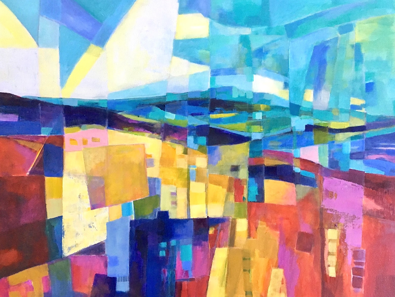
Showing posts with label abstract landscape. Show all posts

Saturday, 14 December 2019

Dance Party

Dance Party
20" x 20" - acrylic on canvas - $400
Once this landscape began to take shape and I found the 'right' palette of colours - pinks, oranges, yellows and dark blue for oomph - the composition came alive with the rhythmic arrangement of brush marks (using my square tip flat paint brush). I love the finished painting and it just looks and feels like a dance party to me. 
Below are a couple of details. Enjoy!

detail

detail

Wednesday, 11 December 2019

Island Sunset

Island Sunset
16" x 16" - acrylic on canvas - $65
Part memory, part imagination, part colour exploration....


 a closer 'detail' look 

Friday, 23 August 2019

Landscape Theme and Variation 1, 2 &3


I spent most of July at a cottage 'up north'. I only had minimal art supplies because I knew that I wouldn't really have anywhere to set up an easel and spread out, as I am want to do. I have already posted some abstracts that I painted then but I also did these 'variations on a landscape theme'. I was really happy with the way they turned out and the range of interpretation. Two of them have found their forever homes, however #1 is still available! Cheers.
#1 - 11" x 11" - acrylic on paper - $45

#2 - 11" x 11" acrylic on paper - SOLD

#3 - 11" X 11" acrylic on paper - SOLD


Tuesday, 23 July 2019

Harlequin Reverie


Harlequin Reverie
24" x 30" - acrylic on canvas - $450
This is my new favourite painting, but I do have to say that several recent works are also in this category LOL! That's a good thing, yes? This one in fact falls into the re-done category. 
Several years ago I painted this work....
.....and was happy with it at the time. I particularly loved the lower half of the composition, its abstract nature and of course the pink- hued palette. However, it did not sell, and was moved around my house, my studio and finally into a dark corner. 
Recently I took another look at it after painting 'Playing with Blocks' (another one I love) and saw how I could keep some of the lower bits, maintain the palette, and re-work the top half into something far more interesting
 
I started by basically blotting out the blue trees, then drew overtop of the composition with a pastel to creating varied tonal/dark and light shapes that implied space, and finally just started painting. 
After about a week of looking at it and really liking it, I realized that it reminded me of the work of Joan Miro, the Spanish surrealist painter whose work you can see here. It wasn't until I had been away for a couple of weeks and then saw it with refreshed eyes that the word 'harlequin' popped into my head and I realized that it was Harlequins Carnival I was connecting to. There is much joy to be found in Miro's famous painting, and I feel the same happiness when I look at mine. In case you are wondering, my harlequins are the round striped shapes moving in a dream-like landscape. They are more abstract rather than anthropomorphic. 'Reverie' means a state of being pleasantly lost in one's thoughts; a daydream. 
Hence the title. Enjoy!

BTW - the colour you see in the painting posted is almost perfect - but reds are difficult to capture exactly, so please know that the work is more red than orange, and much better in life.

Wednesday, 26 June 2019

Letting in the Light

Letting In the Light
18" x 24" - acrylic on canvas - $350
    I have been painting a lot in the last few weeks, but not posting anything, anywhere. I usually work on a couple of paintings at a time, for a bunch of reasons, and eventually they all seem to 'get done' about the same time. Then I need to live with them in order to see if they need more work or are really 'done'. So now it's time to post and show off all the good stuff.
    This work was actually one that I painted years ago after a trip to Scotland several years ago. 2015? You can see the earlier version below. Recently I realized how I could take it further. It seemed to be waiting for me to develop a more abstract vision, which I have been working at over the last few months. So it's not so much a 'redo' as a 'continuation'. The earlier version featured lots of wet paint and drips, which was fun to do. The new work is structurally and compositionally tighter (grids and lines sort of do that automatically) but there is lots of scumbling and areas of colour graduation and variety. The colour shapes and 'lines are only suggested. Love this one, it really does have a special light quality!


Thursday, 23 May 2019

Playing With Blocks


Playing With Blocks
24" x 30" - acrylic on canvas - $450
In the winter of 2018 I was taking a 'Master Class' in Sarasota Florida and was experimenting with de-constructing the landscape into shapes of colour (think Richard Diebenkorn).  I eventually painted the work below, hung it in my house and this winter it sold to friends. 

In April I started a landscape that was very loosely based on a photo reference and the following progress shots show how it developed into the final painting. 
I really liked the potential in the beginning........


but by this point I hated everything about it! What to do....????
with nothing to loose.....I decided to abstract it by breaking the composition down into large rectangular  shapes using a soft white pastel to draw the lines... .
..then I began to see the potential (again) and kept painting, re-defining those shapes through colour and gradation.
Of course the work grew tighter as I painted but I liked the shapes so much that I went with it.  Eventually I added the tiny pieces of collage paper, which are more visible in the the detail below. The idea was to suggest that these colour shapes are lifting up and off the canvas.  
Have to say that I love the finished painting and am really excited about exploring these ideas further.....hope you like it too! 


Friday, 10 May 2019

Wild Garden & Escarpment

Wild Garden
24" x 30" - acrylic on canvas - $400
    This painting is about abstracting forms and using a more muted
(for me) palette.  In this painting I wanted to portray a garden-like field by breaking up the foreground area into abstracted shapes reminiscent of plants and behind that - trees, a lake and distant hills. I was really happy with the composition as it developed and eventually the palette and the overall dominant muted green hue. 

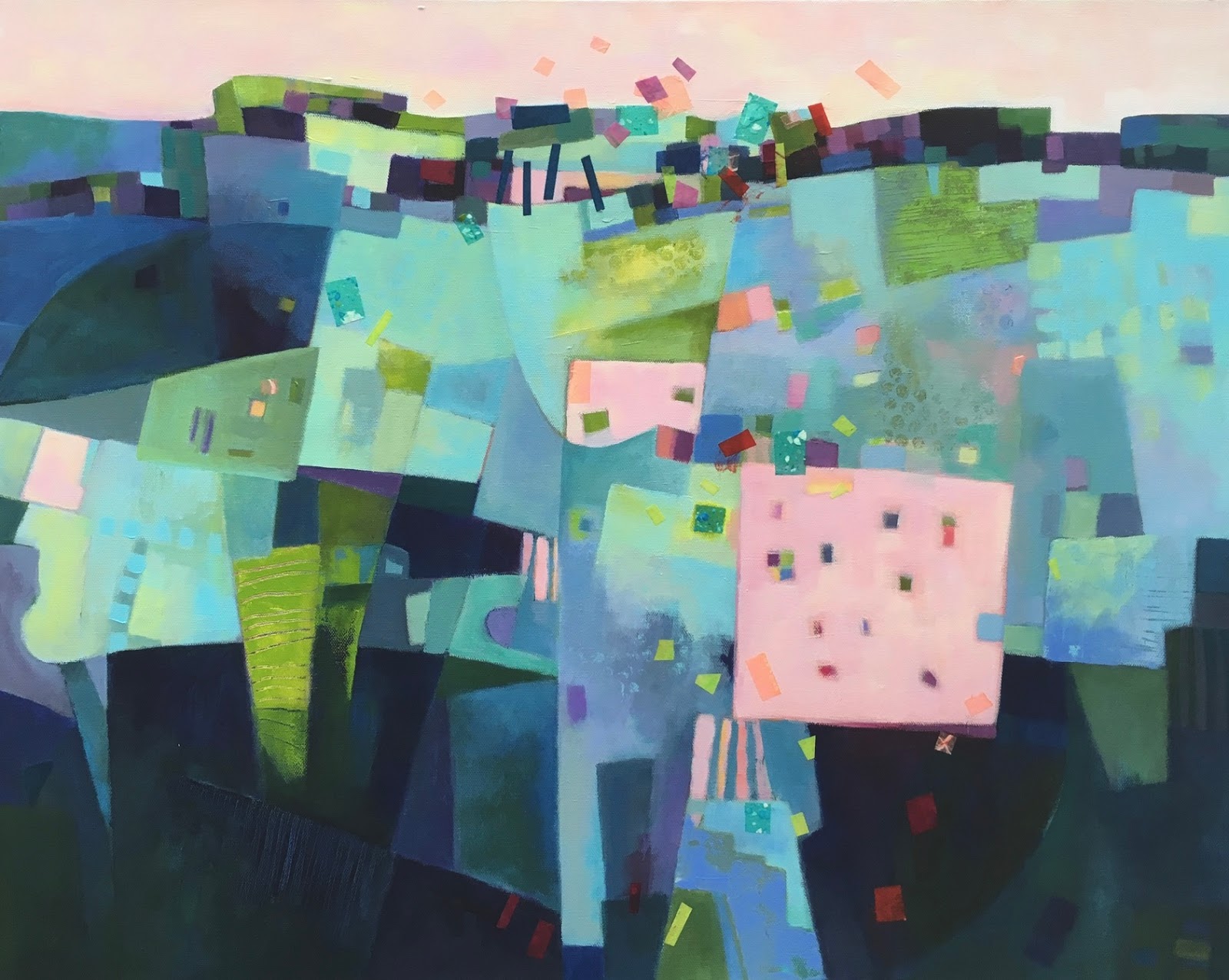
I actually started this work in 2017, however, it languished until this week for a number of reasons, both technical/artistic and timing. I have been on a bit of a 'studio cleaning up binge' lately, finishing a number of works in a similar 'almost done' situation and after an hour at the easel resolved some minor issues in this painting. It's done -  yeah! - and I am really happy with it.  

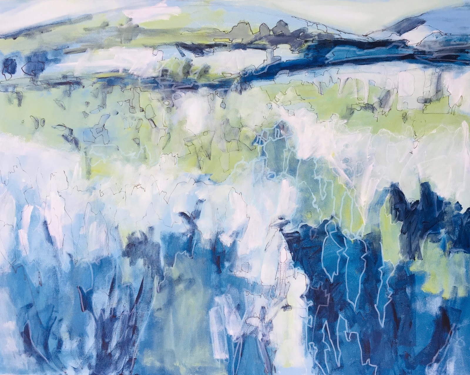
I have to say it looks fabulous next to another painting I did, started and completed two years ago, called Escarpment.
I now realize/see that I never posted it on this blog, so here it is...
Escarpment
30" x 40" - acrylic on canvas -$600
Again I abstracted the vegetation and trees, and used a palette with an overall dominant muted colour - blue-violet.
More finished works to come soon.


Thursday, 9 May 2019

Inner Garden

Inner Garden
24" x 24" - acrylic on canvas - $375
This painting was inspired by the photo below, which apparently I took on June 4th 2017, while in France - though the view could certainly be anywhere in Canada, in June! I liked the arrangement of lights and darks in the photo and wanted to paint a really abstracted view of the scene. 
A couple of process shots follow. By the last photo I decided the light/white area at the right had to go, in spite of the photo. So it did, and I finished the painting. I loved working on this painting and the ultimate freedom it allowed me to move away from reality. Can't wait to start another and see what happens!


detail from finished painting


Tuesday, 7 May 2019

Listen to the Trees


Listen to the Trees
24" x 30" - acrylic on canvas - SOLD
    This painting was inspired by an earlier one in which the individual brush strokes played a major role in the suggestion of form. Painting using this kind of brush work is a process of layering separate strokes of colour, and hoping that something emerges! 
    Two of the process photos are below and give you some idea of the way in which the painting evolved. The final colour scheme was a bit unusual for me (so much green) but what I really like are the 'neutral greys' or the light grey-greens. Unfortunately some of the subtlety and richness of the colours and palette (even the greys) are lost in the photo.   


Monday, 1 April 2019

Tropical Vibe on the South Shore

Tropical Vibe on the South Shore
24" x 36" - acrylic on canvas - $450
Like most painters,  I constantly use a variety of brushes -  small and large ones, square shaped and round ones, all in various sizes. In some recent paintings I have been experimenting with building up layers of colour and form with squarish brush strokes using a 'bright' brush. I like the overall chunky look of these strokes and the way they contribute to abstract quality of the composition. 
This composition is a riff on an earlier one, but using a very different, colourful, high key palette. Lots of intense colour, colour galore in fact!


Tuesday, 19 March 2019

Mirage (diptych)

Mirage    
diptych 8" x 16" (each panel 8"x8") acrylic & mixed media on canvas  $125

I seem to be on a roll with these small format abstracted landscapes painted across two or three canvases. In this latest diptych I used mostly acrylic paint, but also added some beautiful Japanese decorative washi papers and inks. I love how the design and the warm palette of reds, oranges, yellows and magenta came together. Cheers!


Monday, 11 March 2019

Highlands

Highlands   
(Diptych 12" x 24", each panel 12"x12")

acrylic on canvas - SOLD
I am REALLY having fun painting 'imagined abstracted landscapes' across several canvases and then presented as a diptych or triptych. They have provided some welcome relief while painting larger works, and I think (or at least hope) that the smaller works will inform my larger paintings in a positive way. Time will tell I suppose. The title is really in reference to the hill shapes, or 'high lands'.  I have been to Scotland but have only seen photos of the purple heather on those hills, so there is a little creative imagining here. There's lots of great colour (think spring -it's coming) on these two small canvases and textural marks that enliven the surface too. While I try my best to ensure the colour you see in the paintings here is accurate, the paintings are much better in life. For instance the vermillion/orange on the right panel is a touch deeper and really beautiful. Have a great day!

Tuesday, 5 March 2019

My Winter Needs Colour, What About Yours?


My Winter Needs Colour, What About Yours?
Triptych 24" x 10" (each panel 8"x10")          
 acrylic on canvas -  SOLD
I have made several attempts recently, to paint across three small canvases, with each canvas working as a single composition and when put together as a triptych, forming a larger work.  I worked both non-objectively and representationally though fairly abstracted. While I felt that many of these small paintings worked individually, it was a challenge to have all 3 canvases work together successfully.  However, the triptych above does work in this regard and I am very happy with the result. The landscape composition is 'imagined' and the intense palette is in reaction to the white of a northern winter. There is lots of variety in the treatment of the surface with flat opaque colour areas, transparent colour areas, scumbling, scraping, and ink marks. 

left

centre

right


Tuesday, 12 February 2019

Landscape Syncopation

Landscape Syncopation
24" x 20" - acrylic on canvas - SOLD
This work was inspired by the photo below, taken several summers ago at a friend's cottage in Ontario. 
Since then I have made several attempt to interpret it, but none really felt right. Until recently. In the first process shots below (left) I basically had a composition and some colour down, but I didn't want to stay so literal. In the second photo (right) I was trying to abstract the trees more, and chunk up the colour/value shapes of the sky, land, and water and connect them with the trees. 


The more I painted and enlarged the colour/value shapes I became happier and excited, adding more linear black lines and repetitive smaller geometric shapes within the larger ones. It became a process of obliterating but leaving traces of what had been there. I loved what I was seeing emerge. My challenge of course was to not over-work the surface and I think I succeeded. 

When finished it reminded me of Piet Mondrian's "Broadway Boogie Woogie" from 1942-43, hanging in MOMA in NYC. The gallery's label explains that Mondrian "was fascinated by jazz and  boogie woogie music in particular", which was known for its syncopated rhythms

"In musicsyncopation involves a variety of rhythms which are in some way unexpected, making part or all of a tune or piece of music off-beat. More simply, syncopation is "a disturbance or interruption of the regular flow of rhythm......Syncopation can also occur when a strong harmony is placed on a weak beat....".  

I think syncopation appears in my painting through the repetitive and rhythmic arrangement of small and large geometric shapes that together form the landscape elements, but also seem to move or hover on the surface, and act like small abstract compositions within the larger one. 

Wednesday, 23 January 2019

Surface Terrain

Surface Terrain
8" x 8" - acrylic on canvas - SOLD

Experimenting with texture and surface buildup, this one invites touching. 
Is it a landscape? Perhaps. Horizontal planes naturally suggest physical space and the land. The title is slightly oxymoronic. Whatever, I find this little one compelling for its palette and tactile qualities. Cheers.


Tuesday, 15 January 2019

Small paintings continued.....Key West


Key West
8" x 10" - acrylic on canvas - SOLD

I had such fun painting the previous small non-objective (i.e. no discernible subject matter intended) paintings I thought that I would try to keep that groove going.

Always one to push myself, I decided to work on 3 canvases arranged as a triptych, drawing the first lines and shapes over all to connect them, and then began to paint that way too. At stage 1 I loved them....

1

However, I quickly realized that I had created an abstract aerial-styled landscape and then I began to see all sorts of (stylized and abstracted symbolic) objects, which then began to interfere with painting in a more intuitive way. As more paint went on, I felt more restricted by the subject and my initial excitement disappeared. Ho hum

2

3

By stage 3, I only liked the far right panel and put the others aside. This one I called 'Key West' because that's what it makes me think of. More abstract than non-objective, but that's ok. It might be my favourite so far. Really love the arrangement of elements (colour, texture, shape and line) in this one and I hope you do too.  Have a good one!


Friday, 3 November 2017