Showing posts with label contemporary landscape. Show all posts

Saturday, 29 June 2019

On the Edge of Abstraction


On the Edge of Abstraction
16" x 16" - acrylic on canvas - $90
An abstracted landscape of 'grounds' or sections, that move back in space towards the distant horizon and sky, with each section suggesting fields, landforms, and so on. I painted it almost entirely with a palette knife, creating lots of hard edges, many of which were then softened with a brush. 
Have to say I love how it turned out and the vibrant colour scheme! 

Wednesday, 26 June 2019

Letting in the Light

Letting In the Light
18" x 24" - acrylic on canvas - $350
    I have been painting a lot in the last few weeks, but not posting anything, anywhere. I usually work on a couple of paintings at a time, for a bunch of reasons, and eventually they all seem to 'get done' about the same time. Then I need to live with them in order to see if they need more work or are really 'done'. So now it's time to post and show off all the good stuff.
    This work was actually one that I painted years ago after a trip to Scotland several years ago. 2015? You can see the earlier version below. Recently I realized how I could take it further. It seemed to be waiting for me to develop a more abstract vision, which I have been working at over the last few months. So it's not so much a 'redo' as a 'continuation'. The earlier version featured lots of wet paint and drips, which was fun to do. The new work is structurally and compositionally tighter (grids and lines sort of do that automatically) but there is lots of scumbling and areas of colour graduation and variety. The colour shapes and 'lines are only suggested. Love this one, it really does have a special light quality!


Thursday, 23 May 2019

Playing With Blocks


Playing With Blocks
24" x 30" - acrylic on canvas - $450
In the winter of 2018 I was taking a 'Master Class' in Sarasota Florida and was experimenting with de-constructing the landscape into shapes of colour (think Richard Diebenkorn).  I eventually painted the work below, hung it in my house and this winter it sold to friends. 

In April I started a landscape that was very loosely based on a photo reference and the following progress shots show how it developed into the final painting. 
I really liked the potential in the beginning........


but by this point I hated everything about it! What to do....????
with nothing to loose.....I decided to abstract it by breaking the composition down into large rectangular  shapes using a soft white pastel to draw the lines... .
..then I began to see the potential (again) and kept painting, re-defining those shapes through colour and gradation.
Of course the work grew tighter as I painted but I liked the shapes so much that I went with it.  Eventually I added the tiny pieces of collage paper, which are more visible in the the detail below. The idea was to suggest that these colour shapes are lifting up and off the canvas.  
Have to say that I love the finished painting and am really excited about exploring these ideas further.....hope you like it too! 


Tuesday, 5 March 2019

My Winter Needs Colour, What About Yours?


My Winter Needs Colour, What About Yours?
Triptych 24" x 10" (each panel 8"x10")          
 acrylic on canvas -  SOLD
I have made several attempts recently, to paint across three small canvases, with each canvas working as a single composition and when put together as a triptych, forming a larger work.  I worked both non-objectively and representationally though fairly abstracted. While I felt that many of these small paintings worked individually, it was a challenge to have all 3 canvases work together successfully.  However, the triptych above does work in this regard and I am very happy with the result. The landscape composition is 'imagined' and the intense palette is in reaction to the white of a northern winter. There is lots of variety in the treatment of the surface with flat opaque colour areas, transparent colour areas, scumbling, scraping, and ink marks. 

left

centre

right


Wednesday, 6 September 2017

30 in 30 - Day 6 - Red Field

Red Field
8" x 8" - acrylic on canvas paper - SOLD
It's day six in the 30 paintings in 30 days challenge, and here is what I have to show for it. I will admit that I have used this composition before, nonetheless, this one is using a different palette......lots of reds, and magentas....think autumn. 

Wednesday, 16 August 2017

Madeleine Island Dunes


Madeleine Island Dunes
36" x 36" - acrylic on canvas - $700
In September 2015 we spent a few days touring the Les Iles de la Madeleine - a small archipelago (the red islands in the map below) in the Gulf of the Saint Lawrence, that is part of the Province of Quebec. 

As we drove all around the islands we stopped at many of the beaches, not to swim, but to just breathe the ocean air and marvel at the size, isolation and beauty of the them. Some were rugged and some were surrounded by magnificent sand dunes, like these below, the first of which inspired the painting above.


The painting evolved this way......


When I started painting I wasn't sure how much of the magenta ground would ultimately show through. It did however determine the other colours I used, and I really liked what was happening.  It is definitely a lively, colourful painting, but for me, reminiscent of good times, and a beautiful pristine spot in the world. 


Sunday, 13 August 2017

Haliburton Rocks Trees and Colour


Haliburton Rocks, Trees and Colour
36" x 36" - acrylic on canvas - SOLD
Rocky shorelines, trees, and reflections on water are things I am surrounded by each summer in an area called the Haliburton Highland of Ontario. It is a theme I continue to explore and paint every year. I began this particular painting last summer. 

 
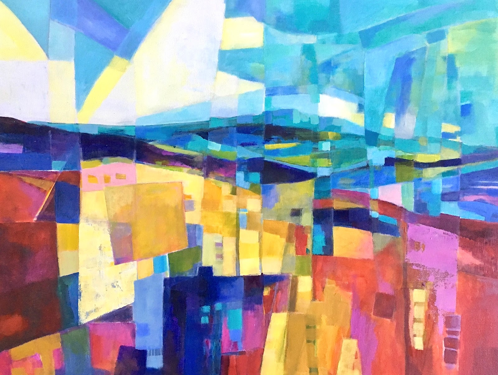
The first version appeared on a rectangular - horizontal  canvas, and looked like this (above).
While there were many things I liked about the painting at this point, there were also things I didn't like. I decided to start again but use a square canvas and focus on the areas I thought were the most interesting. 


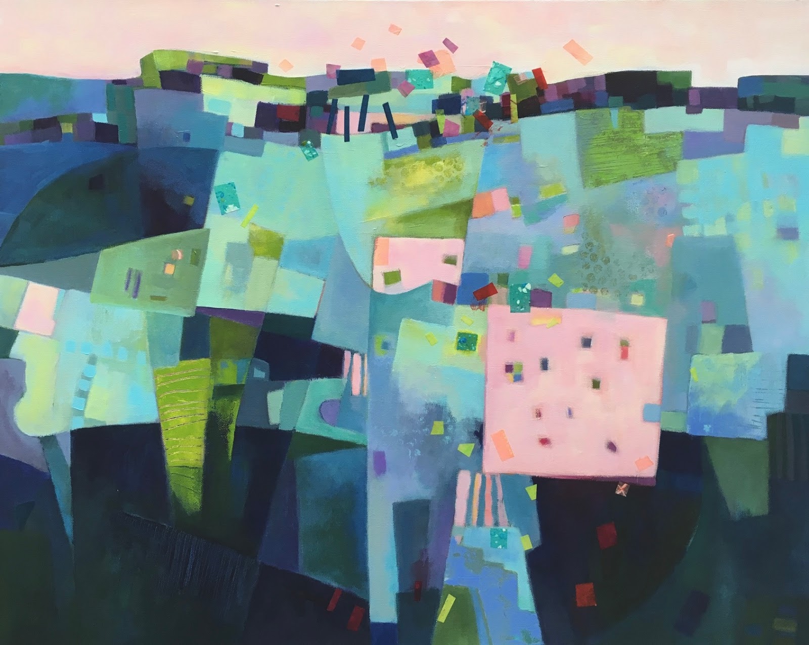
Comparing the 2 pictures above you can see what I maintained in the square version.
I also decided to limit the palette to blues and greens and at this stage really liked the abstract qualities of the landscape space, and ambiguity as to what exactly was depicted.  
 
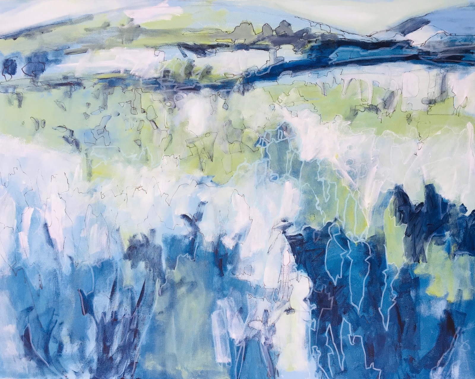
 I continued painting however, and reached this point (above) and it seemed much less exciting. I left it for a few months. At some point last fall I began to tinker with the palette and it looked like this....
and I stopped, not really liking it anymore. In July I decided to give myself and it one more chance and painted a skim of whitish paint over the canvas that left the ghost of the original image. I worked from that but also made changes, re-drew and re-worked the shoreline, background trees and reflected shapes. I came to terms with the palette I wanted. I tried to work quickly and not over work any areas. 
I am really happy that I took another stab at this one, and am really happy with the results, especially the richly coloured palette and the arrangement of and contrast between dark and light coloured abstract shapes.  
Thanks for reading and looking! 


Saturday, 14 January 2017

30 in 30: Day 14 "Fake Lake"

Fake Lake
10" x 10" - acrylic on canvas - $75
I posted an earlier water colour version of this subject a few days ago, and wondered at the time what it would be like in acrylic. A good reason to do another version. I started by sketching the shapes onto the canvas using an 'ink tense' pencil, and then used a wet brush to smear and blur the lines. In this way I stop myself from being too tight and also tone (and mess up) the canvas a little. As I worked I continued to use different coloured ink tense pencils, wetting some of the lines and leaving others. I have been painting with this red-orange-yellow-pink palette a lot lately, and I am really enjoying the colours and results. 
The subject is based on a photo I took of a small man-made lake near where in live in Ontario, and it has been affectionately called by many in the town Fake Lake, hence the title. This is painting number 14 in as many days. 
Looking forward to the end of the month!