Showing posts with label contemporary landscape painting. Show all posts

Thursday, 25 July 2019

Summer Sizzle

Summer Sizzle
12"x12" - acrylic on canvas - $45
     This one is all about line, shape and colour - and you can probably tell what is what in this little stylized landscape. 
    Hope wherever you are, your summer is turning out to 
be a good one.

Sunday, 14 July 2019

Rockin' the Shoreline

Rockin' the Shoreline
acrylic paint on wc heavy paper - 8" x 9.75" - $45
This is another small painting started and completed in the 'fast and loose' painting session from yesterday. Each in this group of 6 is quite different from the others, intentionally, as I had a number of ideas that I wanted to try out without a big time and material commitment. This one reminds me of a very large (4'x6') painting hanging in my living room (but is only about 85% complete - yes another  one of those not-quite-finished-paintings  - but at least the group is starting to shrink) in that there are lots of dark outlines around small and large colour patches and when seen together make up this wonderful kaleidoscope of a landscape. Here is the work in progress...

I think this small painting has some potential for being worked up into a larger canvas, and if that happens, I will definitely get the other one done too. There are just so many things to paint!!!! Love the line, shape and pattern here, and of course the palette of pinks and greys. 

Friday, 11 August 2017

Summer Breeze

Summer Breeze
30" x 24" - acrylic on canvas - $450
I completed this painting a week ago and am really happy with it. My sister said it 'made her smile'.  I love the sense  of rhythm and energy in the shape of the tree branches, brush strokes, and of course the bright, intense colours. It makes me smile too. The composition was inspired by a group of pine trees on a small rocky island near my cottage, on a lake in northern Ontario - a subject I have painted several times and interpreted differently each time (see this and this). Below is an acrylic study I did on paper first, followed by some of the progressive stages on canvas. Thanks for looking!

acrylic study on paper

1
2

3


Sunday, 6 August 2017

Olive Grove at Les Bassacs

Olive Grove at Les Bassacs
30" x 40" - acrylic on canvas - $700
In July I kept returning to my photos taken in Provence searching for subject matter and in particular, olive trees, which I love. (Maybe it's because I really like eating olives, or associate them with Van Gogh, or just see them everywhere in the south.) I chose a photo featuring a group of olive trees, which as you can see, is quite dark, but once 'lightened' seemed like it had potential.

Here are two of the earlier stages.


I was really happy with how this one turned out, and in particular with the palette and stylized foliage. 

Monday, 17 July 2017

The Clearing


The Clearing
30" x 40"  - acrylic on canvas - $600
I started this painting last December and finished it in April, after several starts and stops and time away from it. 
It is loosely based on several photo ideas of 'trees in woods'. I wanted to work with a vertical format and liked the idea of creating a sense of space through a series of receding diagonal lines, and distant trees. Once I started the painting I liked the basic composition but could not quite figure out the trees and how to depict them in a way I was happy with.  Here are some stages.....

At this point I was fairly frustrated and thought that perhaps eliminating some areas or at least making them less distinct might be interesting, so that is what I did.
Unfortunately, I continued to obliterate, went too far and then simply lost anything to work with. Turned the canvas to the wall and ignored it for several weeks.
I hung onto the photos however, then played with ideas, and a few weeks ago decided to try once again. My goal at that point was to be bold, keep the brushwork active, and not to refine or overpaint. I also chose a predominantly green-yellow-purple palette, one that I don't often work with, but really like. In this way the final painting came together fairly quickly, and I think quite successfully too. And it only took four months to paint! 


Saturday, 15 July 2017

Summer Woods


Summer Woods
30" x 40"  - acrylic on canvas - $700
Since the beginning of July I have been living in my 'cabin in the woods on a lake' in the wilds of Haliburton County, about 3 hours north of Toronto. The weather had been mostly unseasonal, unfortunately, but at least it has not interfered with painting. I started this canvas a few weeks ago and it evolved slowly in terms of composition, palette and brushwork to its final form. And I am finally, very happy with it.  The overall colours and especially the yellows, pinks, and reds are actually a little brighter than what you see here and the background purples (on right) are slightly greyer and lighter in value. I tried my best to correct these on photoshop, and this is about the best I can do. 
The sun is shining today and no rain is predicted for at least 24 hours, so I think I will put aside the brushes today and venture forth to the dock and water and do battle with the biting flies. Have a great weekend, wherever you may be.


Monday, 3 October 2016

A Big Weather Day Painting in St Saturnin - Day 4


St. Sat Stormy Sky 
Passing Storm Above St. Sat
I did these two paintings in the Les Bassacs studio, based on photos I took when we painted above the village of St. Saturnin les Apt, looking down on the valley, on day 4. By the middle of my first week in Provence (several weeks ago now)  the weather turned from very hot to unsettled which meant some fabulous skies and somewhat cooler temperatures (much better for painting). I was really happy with these two, as I took my usual creative liberties. 

My morning plein air painting, based on a deep valley view, started out well, but remains unfinished. 
Still waiting for some inspiration 


Thursday, 18 August 2016

Looking Out the Car Window


Looking Out the Car Window
24" x 30"  - acrylic on canvas - $400
Like many of my paintings,  this one is inspired by the scene in a photo I took, from the passenger car window, 
on my drive to our cottage last May.

Despite often 'talking' about wanting to paint in a 'looser' style, I like to abstract nature and reality through shape and colour, and in so doing finish up with paintings that often look like this new work, which is similar in style to the ones below, painted last winter.

SCORCHER
RADIANT RIVER
                                           

Saturday, 5 March 2016

Arcadian Woods

Arcadian Woods
30" x 40" - acrylic on canvas - $800

This is another landscape painting I recently finished in which interpretation is more important than representation. It is now on display at the Longboat Key Centre for the Arts (Florida) as part of their annual juried 'Community' Exhibition. 


Sunday, 8 November 2015

Variation on a Theme: Saignan Valley II

Saignan Valley II
30" x 24"  acrylic on canvas
While working on a larger canvas featuring this same view looking down over the valley from the village of Saignan in Provence, I started this second 'variation'. My idea, once again, was to (try to) keep it loose, painterly and more abstract than the first canvas, which you can see here. 

1
After doing a very quick drawing in my sketchbook, I roughed in the design on the canvas using Inktense pencil crayons - they are like watercolour pencil crayons but the colours are more intense and permanent once dry. I then painted clear water on the pencil lines achieving the blurry, watery effect you see here. I really liked my start but had no idea what to do next. I knew that I would lose the graphic quality through painting - so I left it alone for a few weeks.
2
When I finally returned to the work, I added colour and paint, filling in a few area and leaving other parts alone. I began to really enjoy the white parts (actually unpainted canvas) and decided to maintain them, but did add white paint. Slowly I added more colour but kept the shapes big, while playing with perspective.

3
Knowing that the foreground flowers would be various shades of magenta, I wanted to tone the entire work down with a chromatic grey elsewhere.  And so it went. Final touches were added with the inktense pencils, outlining shapes for emphasis and adding surface detail. 
Fun! And fairly loose and abstract too!


Friday, 6 November 2015

Variations on a Theme: Below Saignan

During the summer I painted several variations of a particular image that I found both intriguing and inspiring. (Truth be told, I have probably always done this.) This fall I  have been re-visiting images and scenes that I have painted in the past - and that has resulted in a number of related works and variations on a theme. 
The first theme or subject was inspired by a particular view looking over the Luberon Valley (in Provence) from the small village of Saignan. I was there is 2014 and painted this watercolour in situ, at the time. 

                             
Of course I also took many photos and thought that I might do another version in acrylic once home. 


Looking around for a subject in October, I re-discovered these photos and decided to try a much larger version of the same scene - and this is how it evolved.

           
1
2
I quite liked what I had by stage 2, however it really didn't look as good as it does here in the photo. I needed to resolve the middle ground, and the foreground flowers - and keep it loose. Easy! Hah!


3
4
               
Stage 3 was tighter, and by stage 4 it felt like a disaster. At that point I felt quite discouraged and ready to white it all out out and forget the whole thing - or - try something really different  - and turn the whole thing into a mixed media work with collage papers and acrylic paint. This approach sounded like a lot more fun, so that is what I did. I have a very large collection of textured Japanese rice and mulberry papers, in various colours and patterns and began to apply them over the painting, leaving lots of painted areas exposed. Then I painted over those papers to blend them into the painted areas and to soften the colours of some of the papers. I continued working this way until it was finished.  The final work looks like this. It has a wonderfully varied and textured surface, protected by several layers of medium and varnish. I am delighted with the result and will definitely do this again.

The Valley Below Saignan I
40" x 30"  - collage papers & acrylic on canvas 


Sunday, 2 August 2015

Painting an Old Ochre Quarry in the Luberon Valley, encore

Old Ochre Quarry in the Luberon
24"x 30" - acrylic on canvas - SOLD
In May I painted in an old abandoned ochre quarry in the Luberon Valley. At the time it was a challenge to paint the cast (tree) shadows as the light and therefore their shapes, kept changing. I took lots of photos with the intention of  returning to this subject once home. Parts of this painting were easy and therefore fun to paint, other areas like the foreground were a challenge and I had to do a lot of 'landscape editing'. The colour ochre and yellow were the staring point colours for the palette, which then demanded the complementary shades of purple through red and pink, which then required green. Tried to keep blue out of this one, but some still sneaked in.  
Have a great weekend.

Sunday, 23 November 2014

Colourfield I

Colourfield I
28" x 22" - acrylic on canvas
This is for sale - contact me for price if interested.
While I was painting the large water lily painting (see earlier posts!) I worked on this landscape too.
The composition is based on a subject/photo I have used before - but interpreted each time, quite differently. In this painting I simplified the landscape field into a number of connecting horizontal shapes, which became more abstract and defined as they moved forwards and down the picture plane. The colour scheme developed as I painted, but essentially followed the value pattern based on the photo. The background trees and especially the clump you see on the right were the biggest challenge, in terms of colour and differentiating it from the foreground detail, to suggest the illusion of depth and aerial perspective. This was such fun to paint that I can't wait to paint others in this loose, abstract style.

Tuesday, 6 December 2011

Redstone River Recollect

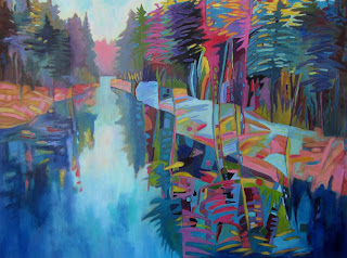
In previous posts I have mentioned that I spend the summer months in Haliburton. We have a small cottage on a large island on Redstone Lake, a beautiful pristine lake that is clean, deep and utterly rejuvenating. Driving to and from the boat landing we pass the Redstone River which connects our lake with Eagle Lake next door. Though this river is really not much more than a stream as it is shallow and its' width varies throughout the season, I am always fascinated by how it curves and meanders towards the road.  It is one of my favourite views in Haliburton and each time I see it, we have to stop the car so I can take more pictures of it.
I have painted this river several times now as I am inspired with each new photo and of course the changes that appear with each new season. I just finished the latest variation on this theme four days ago and here it is:
A Summer Day on the Redstone River    24" x 30"   SOLD
Here is a slightly different view I started last spring, and finally finished in September. I love the different palette temperatures - how the warm yellows, oranges and pinks suggest a summer afternoon in the painting above while the acidic yellow greens suggest a spring morning in the painting below.

Almost There   24" x 36"  SOLD
During a workshop I conducted this fall for SOYRA (the Society of York Region Artists) on how to use soft pastel with acrylic paints, I used this subject for my demonstration. I actually did two versions, both much more stylized and looser (and smaller) than the larger paintings above. 

River Encore I    16" x 20"

River Encore II     16" x 20"
And the last one I want to include in this collection is a landscape I included in one of my first posts, and my first painting based on this subject:

August Afternoon on the Redstone River    30"x30" sold
I love this subject and I am sure I will work on it again. What do you think about using the same subject again and again?


Saturday, 3 December 2011

Carpe Diem

Carpe Diem  30"x30" acrylic  SOLD
This landscape, completed about 3 weeks ago, is part of the on-going series of paintings featuring wetlands in the Haliburton Highlands (part of Ontario cottage country). Below is the photograph I took from the car window while driving east along highway 118 on which this particular work is based. Can you locate the landscape detail in the photo that I enlarged and focused on in this work?


I painted an earlier version of this composition last spring that I am not going to show you. It was one of those paintings that started out well, but went downhill, as I continued to paint. Soon after it was finished and hanging on my kitchen wall (and therefore getting lots of critical attention from me and my ever helpful husband) I realized that it was not going to last. So it was with some trepidation that I decide to try to paint this view one more time. I am glad I did as I am quite happy with this version. The blue tonality of the work helps to suggest (but not specify) the season/the time of day, and a sense of peacefulness  - hence the title. 
Have a great weekend!