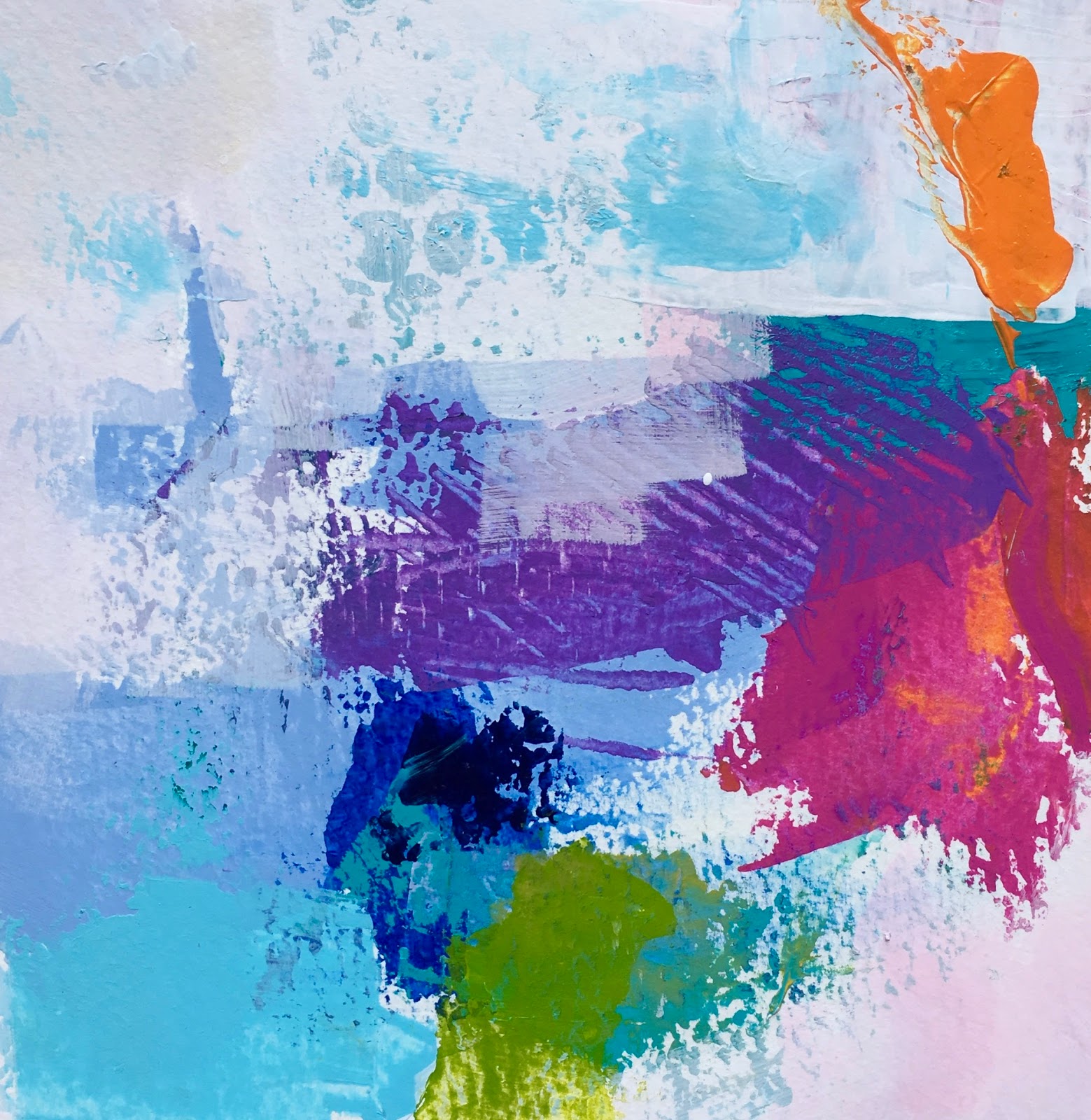
Harlequin Reverie
24" x 30" - acrylic on canvas - $450
This is my new favourite painting, but I do have to say that several recent works are also in this category LOL! That's a good thing, yes? This one in fact falls into the re-done category.
Several years ago I painted this work....
.....and was happy with it at the time. I particularly loved the lower half of the composition, its abstract nature and of course the pink- hued palette. However, it did not sell, and was moved around my house, my studio and finally into a dark corner.
Recently I took another look at it after painting 'Playing with Blocks' (another one I love) and saw how I could keep some of the lower bits, maintain the palette, and re-work the top half into something far more interesting
I started by basically blotting out the blue trees, then drew overtop of the composition with a pastel to creating varied tonal/dark and light shapes that implied space, and finally just started painting.
After about a week of looking at it and really liking it, I realized that it reminded me of the work of Joan Miro, the Spanish surrealist painter whose work you can see here. It wasn't until I had been away for a couple of weeks and then saw it with refreshed eyes that the word 'harlequin' popped into my head and I realized that it was Harlequins Carnival I was connecting to. There is much joy to be found in Miro's famous painting, and I feel the same happiness when I look at mine. In case you are wondering, my harlequins are the round striped shapes moving in a dream-like landscape. They are more abstract rather than anthropomorphic. 'Reverie' means a state of being pleasantly lost in one's thoughts; a daydream.
Hence the title. Enjoy!
BTW - the colour you see in the painting posted is almost perfect - but reds are difficult to capture exactly, so please know that the work is more red than orange, and much better in life.