Monday, 5 October 2015

Still Life With Flowers: Harmony in Yellows and Reds

Still Life With Flowers: Harmony in Yellows and Reds
36" x 36"  -  acrylic on canvas

I haven't painted flowers in a long long time, yet I continue to take photos of them and every once in a while I draw them, and then think about painting them.....but don't.  In the past I tended to paint them in a 'contemporary realist' manner, but my current tendency towards simplification and abstraction in landscape, prevailed in this painting as well. 
I cropped the photo to a square format but did not change the arrangement of the flowers in the composition as I thought it was a good one. I drew the flowers  on the canvas with a brush and black acrylic paint and a brush, then began to 'fill in' in the colour, slowly eradicating the outlines and adding expressive marks with pastel. I maintained the actual colour of the flowers, but simplified the background elements and palette there.  I really like the finished work, it's larger than life scale, overall composition, surprise shapes of colour and marks in the background. It presently hangs in my kitchen dining area, on a wall that receives late afternoon sun, and when it falls on the painting, the warm ochre, yellows, reds and pinks, glow. 


Saturday, 3 October 2015

Catching Up

It has been awhile indeed. Life has been busy with travel, socializing, visiting and just stuff.  I finally got back to the studio and painting about 2 weeks ago after a 4 week hiatus - and started some new paintings, and tinkered with some old ones too.
Island Retreat  
(formerly called 'Blue Pines')
24" x 24"  -  acrylic on canvas - SOLD
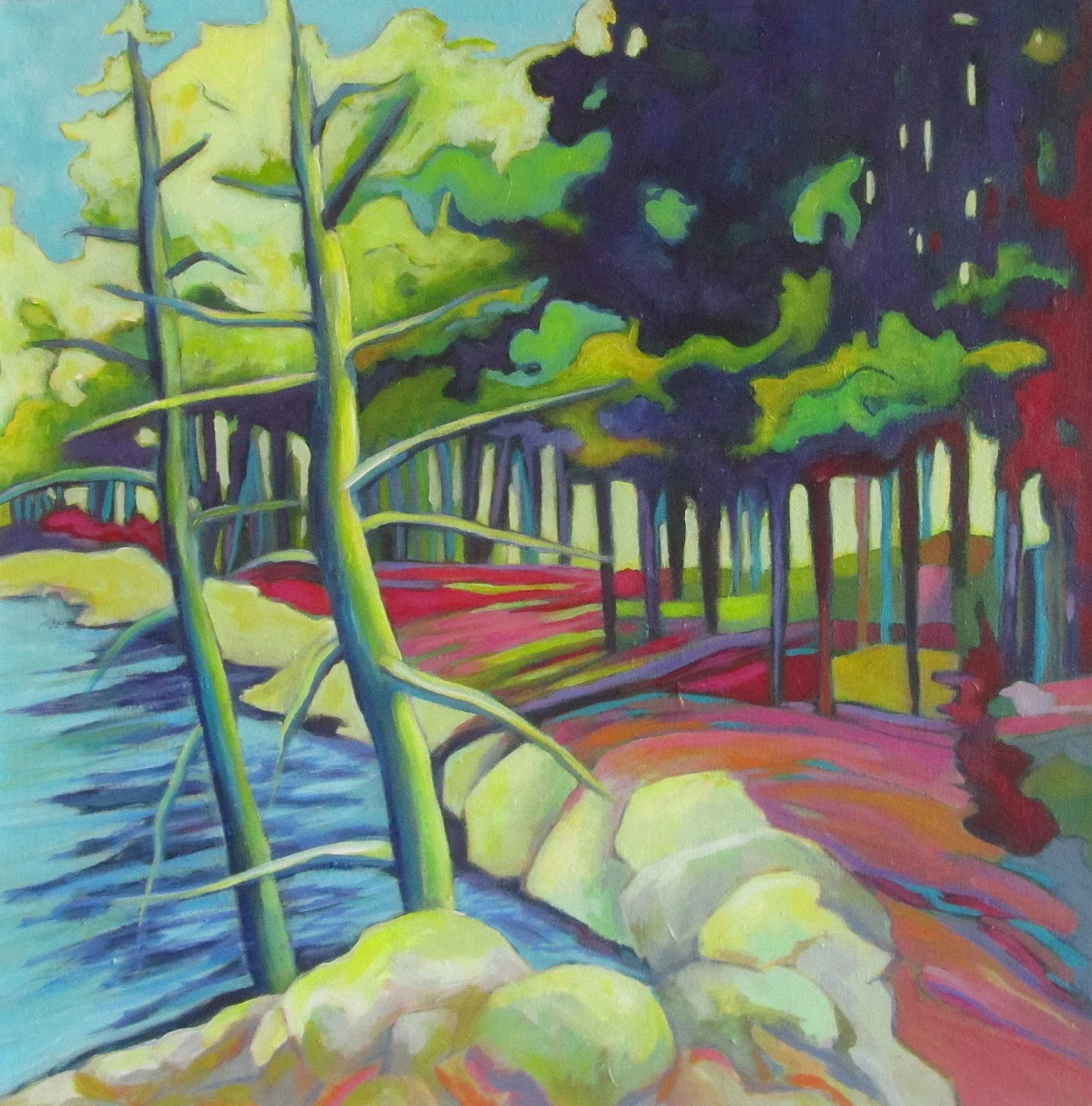
I first posted this painting last September and called it Blue Pines . At the time I felt it was finished but more recently I began to feel that the palette was not quite right, particularly in the foreground rocks. I experimented with the image and colour in photoshop and decided on the changes that you see here - pushing the blues and yellows towards green, adding complementary reds, and giving the rocks more definition - and I was quite happy with how it turned out. 

Sunday, 30 August 2015

Summer's End


Summer's End
24" x 18" - acrylic on canvas - SOLD
Summer is winding down as is painting at my cottage. This one is based on a photo I snapped as we canoed around the big island, and interpreted using a palette of saturated complementary colours. I love the ochre yellow sky - it makes me think of goldenrod and the fall colours to come. But weather is still warm, and we still have another week until labour day! I will be in Atlantic Canada, visiting friends and family and of course gathering imagery for future paintings. I hope you enjoy yourself and the final days of August wherever you are.

Friday, 28 August 2015

Northern Escape "Escapism"

Escapism
24" x 30"  -  acrylic on canvas  - SOLD
This painting is based on the same Haliburton landscape image of rocks and trees I have been
fascinated with all summer, and is the third variation on this theme. What  I really wanted to do (and did) in this version was to have a very light and warm palette, and stylize the tree and rock forms. 
And just for fun I started another version, but it is really in its incubation stage and will be there for a few more weeks. 

Saturday, 22 August 2015

Moo Cow - Last week's DailyPaintworks Challenge

Moo Cow
16" x 16" - acrylic on canvas - SOLD
It has been a few weeks since my last post, but that is not for want of trying, or painting. During that time there were starts and stops and wipeouts; then some perseverance prevailed, and I finally have something to show for my efforts. I worked on some landscapes and this one - a cow painting. Who doesn't like a cow painting?  Years ago I painted lots of them (and sheep too) but got away from them - however decided to revisit that theme because last week's DailyPaintworks challenge was just that. Good fun. May paint a few more too.  


Thursday, 6 August 2015

Northern Escape Abstract

Northern Escape Abstract
30" x 36"  acrylic on canvas  SOLD
This is the second painting based on a small drawing of a typical Haliburton Highlands/Ontario cottage country landscape - and one that I had a lot of fun painting. When I began the painting I wanted to restrict my usual exuberant palette to one that was more muted and neutral, but because I always try to pay attention to what the painting needs as it proceeds, and not to some pre-conceived plan, that idea was abandoned fairly quickly. I thought about adding 'real' texture, but the decided the paint splatters would have to do. I did a lot of drawing back into the painting with soft pastels, which I then fixed with  Spectra Fix  - a wonderful, non-toxic, very safe and easy to use product that anyone who works with pastels or charcoal should try. I am quite happy with this work - it's big and bold - just like what it represents.  Cheers!


Wednesday, 5 August 2015

Northern Escape - More Rocks and Trees

Northern Escape
16" x 18"  - acrylic on canvas -  SOLD
I seem to be flipping back and forth between painting Provence landscapes and northern Ontario landscapes these days. Perhaps I am feeling nostalgic about my painting experience in France as I love sifting through those photos, but at the same time I am surrounded by the rugged beauty of mixed forests, dark blue lakes, dramatic skies, and rocky shorelines - what we call cottage country in Ontario.

This painting encapsulates the physical nature of this kind of landscape, and I hope the spirit too. My preliminary drawing was a quick one, and more abstract then I intended the painting to be. As I painted this one I kept thinking about the drawing and so I started a second more abstract version, and worked on both of them at the same time. More on that one in my  next post.